


Our New Look
Contributed by Sarah Jane Silverman
You may have noticed that Junior League of Annapolis has a new look! Launched during the 2014 Military Bowl Parade in December, JLA underwent a two-year rebranding process that included an entirely new identity system, complete with new website.
![]()
Annapolis, along with Baltimore and Washington, D.C., form almost a perfect triangle. Annapolis, being the smaller of the three cities, is made up many residents commuting daily to Baltimore and DC. All three cities have leagues, with DC capturing most of the attention, and larger donors and sponsors.
Annapolis is also a booming city, with a quaint town feel, but ambitious and forward-thinking individuals. In order to stay abreast of changes in technology, new non-profits competing for sponsors, donors and members, and to remain relevant in the community, JLA saw the need for a full rebranding campaign and strategy.
Though the Junior League has brand recognition across the nation, Junior League of Annapolis was struggling for recognition within the community–both from press media outlets, supporters and potential members. Rebranding the League offered a refreshed identity that the community could relate to, understand and recognize.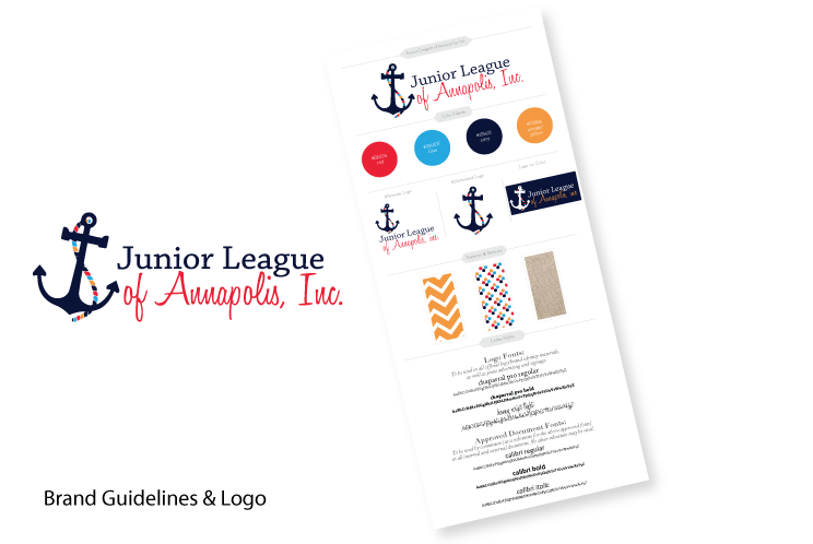
A brand is created to translate the mission and vision of a company or organization. Junior League of Annapolis, as a brand, needed an identity that was specific to the local community. Poorly designed graphics, logo misusage, and the need for brand recognition in the Annapolis community served as primary reasons for a rebranding campaign. Between volunteer chair turnover, and changing technology, refreshed identity was critical to ensure the future success of JLA.
When creating a new brand identity for JLA, the topic of social media and online responsiveness were at the forefront of the redesign. To address the ever-changing needs of technology, and ensure JLA maintains an active presence online, the brand identity was specifically designed to work seamlessly on social media, while easily translating the mission and vision of the League from print to web.
The rebranding efforts of JLA began with a comprehensive brand research and competitive analysis, examining our League against others, as well as examining other volunteer organizations and non-profits in the DC Metro area. Members of the Communications Council spent hours brainstorming logo mark identities that combined the nautical association of Annapolis, with the League’s dedication to the community.
Furthermore, the brand system was designed to take into account the individual needs of committees. For instance, the color scheme and identity of JLA works seamlessly with the annual Volunteers on the Run 5K event, hosted by JLA each year.

To maintain consistency, a new color palette was created, incorporating the standard Junior League red, as well as the bright blue color that JLA had been using for the last several years. The symbol of an anchor was chosen, for its association with sailing and Annapolis, as well as its meaning of hope.
We believe JLA serves as a hope for our community, through the projects and efforts put forth by members each year, for the purpose of creating lasting positive change in Anne Arundel Community. The anchor symbol in the logo include a rope wrapped around it, incorporating all colors of the new color scheme. This was chosen to add a playful feel to the logo, while adding extra brand recognition, incorporating the new JLA colors against the standard, vertical-positioned anchors synonymous with Annapolis.
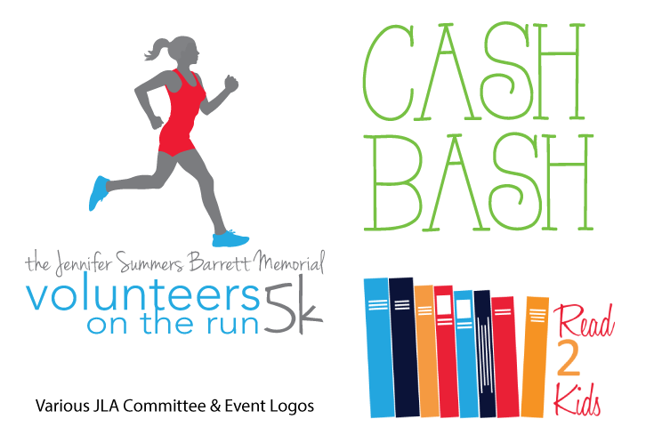
Various options for logo usage were included, to be used as the discretion of individual committees, under the supervision of External Communications. The new brand identity system offers a variety of textures and patterns, color scheme, and new corporate identity package to keep up with the demands for web, print and promotional pieces such as clothing. Individual logo identities for JLA projects and events were designed and/or redesigned to offer advanced design graphics, as well as a visual identity that complies with the new brand strategy of JLA.*
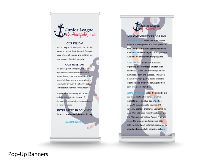
New out-of-home signage was created, including outdoor banners, yard signs, and pop-up banners to be used at the disposable of individual committees. Print collateral pieces were redesigned including an official JLA one-page Fact Sheet, tri-fold brochure, cookbook recipe cards, and seasonal Annual Campaign brochures.
Social Media profiles were created and/or updated to reach new audiences and stay connected to current audiences. JLA is active on Flickr, Pinterest, Google Plus, Twitter, Facebook, and Instagram. Processes are in place to maximize the exposure of news coverage, event announcements, blog articles and photo coverage gathered live during events and meetings. These processes also ensure constant interaction with members, prospective members, and community members.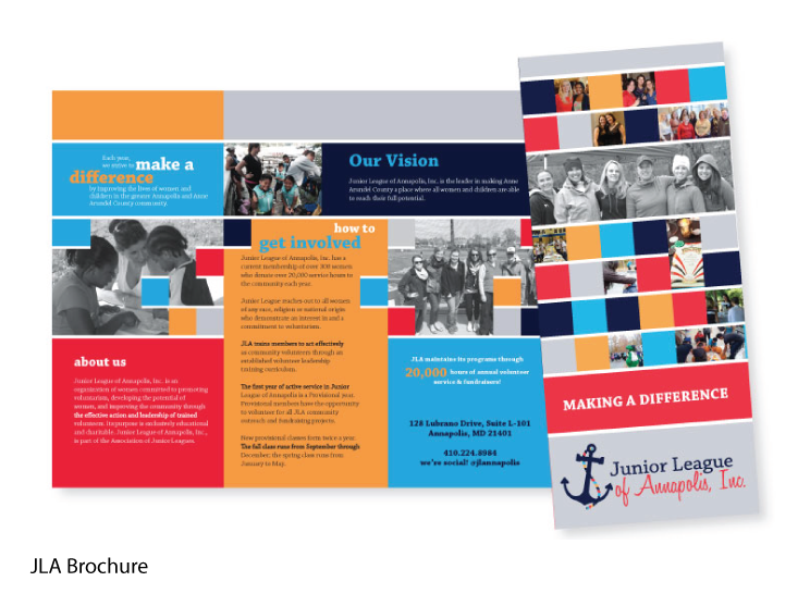
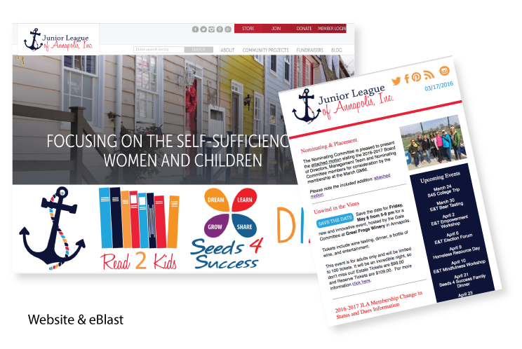
In addition to the new brand identity, JLA sought out Digital Cheetah to create a new website design, as well as offer advanced technology integration to its members through the various consoles available from Digital Cheetah. It’s important to know that not only did JLA need an entire visual identity overhaul, but a backend overhaul as well.
Resources for committee chairs were missing through years of passing down printed binders, then thumb drives, followed by access to individual accounts on cloud storage drives. There was no consistency, both internally and externally.
Along with the new brand identity, including logo and corporate identity package, JLA hired Digital Cheetah to redesign its website and developed an ad campaign incorporating a combination of public event participation, online advertising, a social media campaign, and fostering a new relationship with media contacts and local photographers to develop the portfolio of professional photography (coming soon!) available to JLA for the purpose of marketing and communications, public relations, and advertising.
Since rebranding, the League has reached a new high of provisional members seeking membership into the League. There has been coverage from new media contacts, including more-in-depth coverage from previous media outlets. The League increased its exposure in the public by attending the 2015 Military Bowl Parade, for a second year in a row.
The official Junior League of Annapolis blog was redesigned, including an RSS feed emailed to subscribers with each new article. The weekly eblast was redesigned to offer a new visually appealing newsletter for members, branded with the new JLA identity. Both the blog RSS email and eblast were designed with future advertising placement opportunities in mind, offering extra coverage for sponsors and donors, and an additional fundraising opportunity for JLA.
It’s been a good year!
*The only exception to committees strictly following the new brand guidelines is Gala. We feel it is more important that the events, hosted by the Gala Committee, boast creative marketing that is tailored to the individual event, rather than strictly the League–given that in turn, the success of said events directly benefits the League.